Dashboards
The dashboard mechanism allows you to create new tabs with an arbitrary set of tools to work effectively with devices connected to the satellite bus.
General description
Dashboards can be configured to work effectively with a specific device. According to the user's preferences, tools for analyzing telemetry coming from the device can be placed and the necessary control commands or command sets can be formed for operational control of the device, including without using the command queue window. An example of the appearance of the panel is shown in Figure 1.

Picture 1. The appearance of the dashboard
Three types of tools are supported:
- Charts (Plots);
- Field value tracking (Watch);
- buttons for sending commands (Actions).
The dashboard menu includes the following items:
- Enable/Disable - activation of data acquisition, with Enable – the plotting continues based on the received data, with Disable – the plotting stops;
- Add – adding a new chart to the panel;
- Panel – export the panel to a racks*.hir file;
- Plots – setting the Autoscale mode for automatic scaling of graphs.
Creating a new panel
To create a new panel, select "Window - New instrument panel" in the menu, after which a dialog box will appear to enter the name of the new panel (Picture 2):
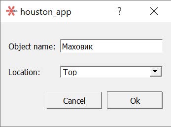
Picture 2. Creating a new panel
In the input window, specify:
- Object name – the name of the panel;
- Location – initial placement of the panel in the main window by HA (can be changed later).
After entering the data, press Ok. The new dashboard will appear inside the main window BY HA (Picture 3):
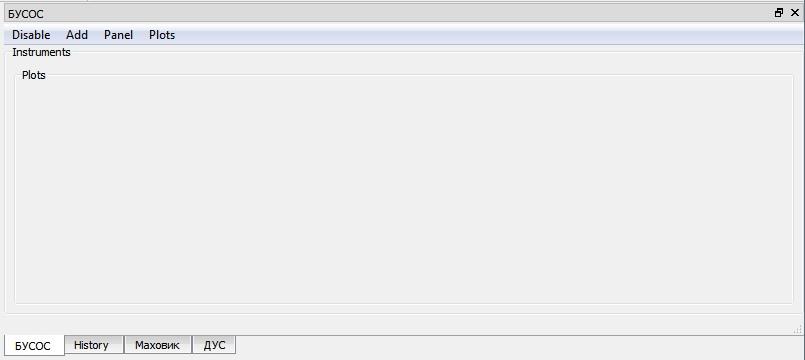
Picture 3. New dashboard
Formation of the dashboard
After creating a new dashboard, menus for inserting control elements become available. To create a graph by field, you need to configure the graph output area, this is done in the dashboard menu "Add - CustomPlot..." and fill in the fields of the dialog box (Picture 4):
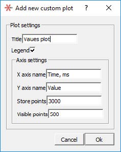
Picture 4. Creating a new schedule
Where:
- Title – name of the print area;
- Legend – show the legend on the chart;
- X axis name – the displayed name of the X axis;
- Y axis name – the displayed name of the Y axis;
- Store points – the number of graph points (large values can cause performance problems for fast data flow);
- Visible points – the number of displayed points. After entering the data, click Ok.
Context menu items will be available on the Fields command bar to display parameter values on the dashboard. Open the command in the Fields panel, the fields of which include the value whose values should be displayed.
Right-clicking on the input field of the value of interest opens the context menu. When you select Add to plot, a list of generated dashboards and their elements – graphs and fields of the last value Watch opens. Click on the corresponding graph or field Watch (Picture 5):
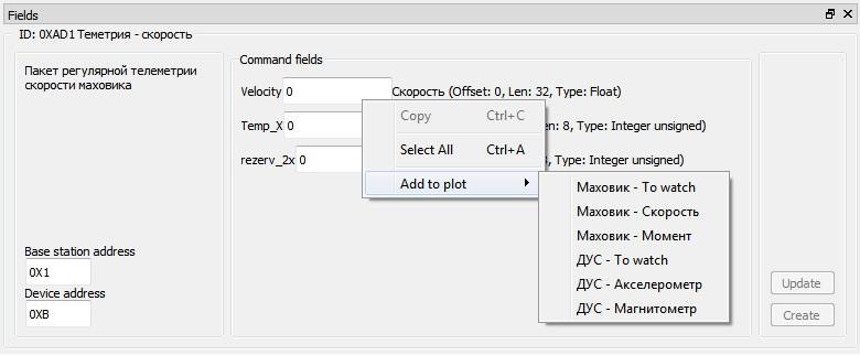
Picture 5. A list of generated dashboards and their elements
To install the command buttons on the dashboard, right-click on the corresponding command on the Fields panel.
In the context menu that opens, select Add to rack (Picture 6). A list of dashboards opens, in which you should select the panel to install the command button. Similarly, you can set the command button from the Queue panel.
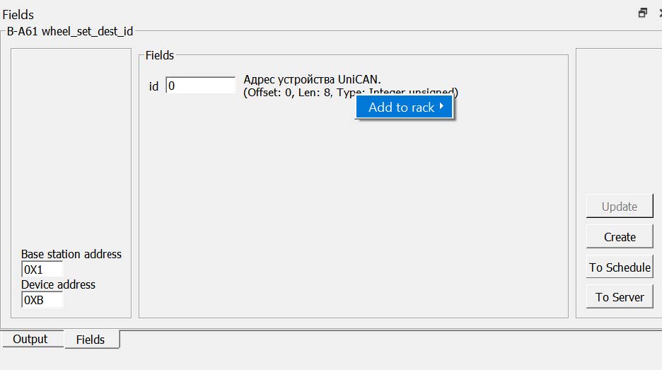
Picture 6. Add to rack item
For the new button, enter a name in the window that opens (Picture 7):
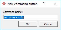
Picture 7. The name of the new button
New buttons are installed on the dashboard, and "hot keys" are added to the first 10 buttons from the "0" to "9" keys (numbers on the main keyboard panel).
Exporting the panel
The generated dashboard can be saved to a file, to do this, select "Panel - Export..." in the dashboard menu and select the file name. The file has the extension ".hir".
Connecting the panel file
When the program is loaded, panels and files are automatically loaded *.the hirs of which are located in the \Resources\Racks folder. If panel loading errors occur, error descriptions will be displayed in the message window, and problematic items will not be placed on the dashboard. Errors usually occur in cases where the downloaded panel was created with a different set of satellite map files and device protocols.
Using the panel
Activation of receiving data on the panel is performed by pressing the Enable/Disable menu. When starting the Houston App, all panels are active. With a large flow of information and the use of several active panels with graphs, performance problems may occur.
To reduce the load on the Houston App software, it is recommended not to display multiple panels at the same time, but to make tabs out of them. You can also disable unused panels, or disable Autoscale mode for graphs.
Any items added to the panel can be removed from the context menu. The panels themselves can be unloaded from the program via the Window - Destroy dock widget menu.
Charts
Picture 8. Functions of the plotting area
The plotting area supports the following functions (Picture 8):
- scaling of graphs (on both axes or on one axis);
- Double-click editing of the area name and axis labels;
- automatic scaling (Plots menu – Autoscale);
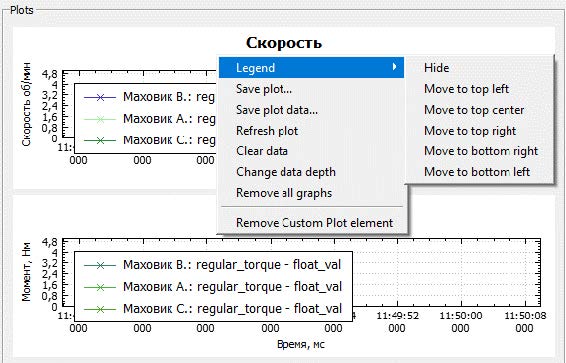
- Legend – show/hide/move the description of the graph designations;
- Save plot – save the current image to a graphic file (png, jpeg, pdf, bmp);
- Save plot data saving the data of the selected graph to a .csv file (attention, downloading a large amount of data may take a long time);
- Refresh plot – redrawing the graph;
- Clear data – clear graph data;
- Change data depth – the number of points displayed on the chart;
- Remove all graphs – delete constructed graphs;
- Remove Custom plot element – delete the plotting field.
To get the exact value at the selected point of the graph, select the graph and double-click to create a "marker" at the point of interest. The status bar will display the values of this graph point (Picture 9):
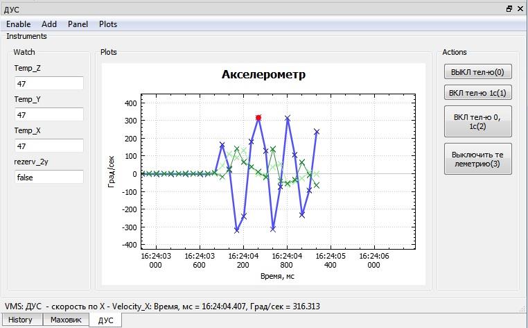
Picture 9. Getting the exact value at the selected point
Buttons for sending commands
Command sending buttons can be configured to send one or more commands. In the latter case, a 1 ms pause is inserted between sending commands. The composition of the commands corresponding to the button can be seen in the "hint" when you hover the mouse over the button area (Picture 10):

Picture 10. The composition of the teams
When adding a button to the panel, "hotkeys" are assigned for the first 10, which are indicated in parentheses after the button name. When the hotkey is pressed, the same sequence is sent as when the mouse clicks on the button. The action is confirmed by displaying a message in the message window. For the "hot keys" to work correctly, it is necessary that the focus (cursor) be on the button area at the time of pressing.
Attention! The buttons work without using a command queue, sending data to the satellite without confirmation. Care must be taken when using them.
Tracking values
Allows you to quickly track the last value of the selected field on the dashboard. It is recommended to use it for fields that rarely change their value.