09 Lesson. Data analysis
Data analysis using Excel
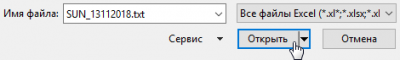
Open the resulting data file in Excel. Press Ctrl-O and select the folder containing the file. By default, Excel does not open txt files, then type * in the field and press Enter, all files will be shown. Select the data file and click Open.
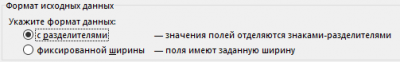
This will launch the import wizard. Click Next. On the first page, specify the "delimited" data form.
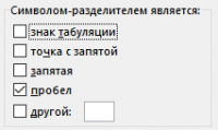
On the second page, specify that the column separator is a space.
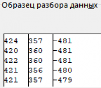
Make sure that in the sample data window all columns are separated by vertical lines, then click Next.
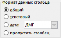
The column data format should remain "generic". Click "Done", the data will be written to an Excel sheet.
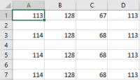
Obviously, the data is separated by empty lines. To delete empty rows, select the first column.
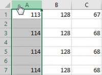
Press F5, then click "Select" in the displayed window.
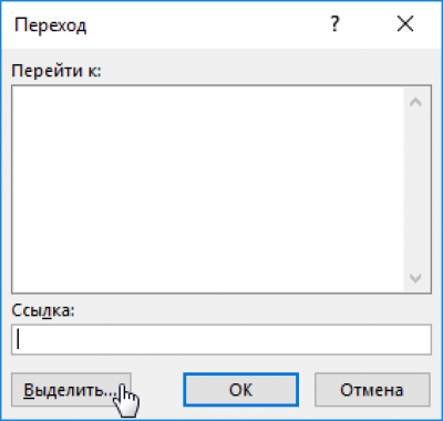
Check the "empty cells" box and click OK.
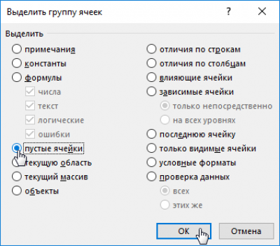
All empty cells from the first column will be selected.
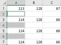
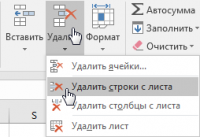
Now delete the rows that have empty cells. Click.
Now the data is ready for analysis and charting.
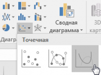
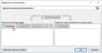
Please note! The first lines contain identical data, because OrbiCraft started rotating with a delay of 5 seconds. Insert a point diagram with smooth curves into the document and click the data selection button.

Click the add data button.
Do not enter the name of the line. Click on the "X values" window and select all cells from the first column by clicking on the column header.
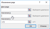
Then click "Y values", delete the "{1}" characters so that only the equal sign remains, and then select the entire second column with data by clicking on the column header.
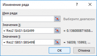
The first row of data will be displayed in the data source selection window.

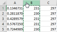
Click OK to close the data selection window. Place the cursor in the upper-right corner of the second column and drag it to the right to capture all the data.
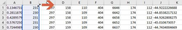
Select columns from "B" to "I".
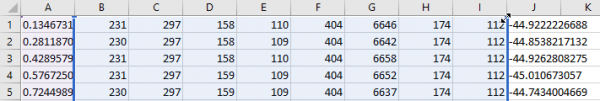
Now the chart will include all the data collected from the solar sensors. Pay attention to the "spikes" in the diagram - these are measurement errors.
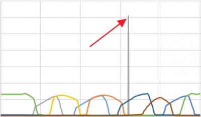
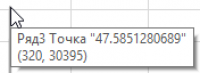
Place the cursor on the "splash" and find the row with the erroneous data in the table.
Note that the erroneous values are very different from the neighboring values.
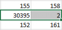
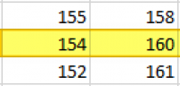
Manually change the incorrect values by replacing them with the average values of neighboring cells.
The diagram based on the cleaned data should be approximately as shown in the diagram below:
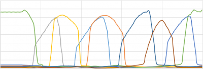
Please note! The first lines contain identical data, as can be seen from the diagram.
Data preparation
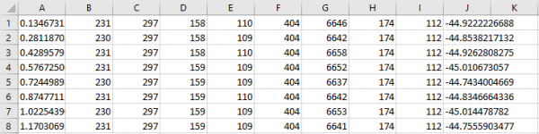
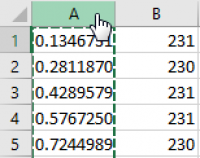
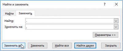
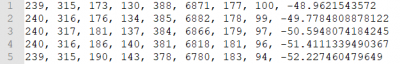
All decimal values in our table are assigned to the left borders of the cells: this means that Excel interprets them as text data. Of course, Excel does not use a dot for decimal numbers, but a comma separating the integer part from the decimal. We need to replace all the dots with commas in our file. To do this, press Ctrl-H and enter a period in the upper window, and enter a comma in the lower window.
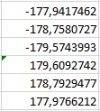
Scroll down the table and remember the last value of the measured angle.
![]()
Delete all the data at the beginning of the table up to this corner.
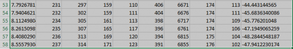
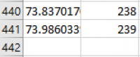
Now the data will start and end at approximately the same angle, which means that OrbiCraft has performed one rotation around its radial axis. Given that the magnetometer measures angles with some error, its readings are not a reliable basis for positioning solar sensors. Since OrbiCraft rotated evenly during data collection, we can calculate the exact angles. Count the total number of rows of data (in the example, it turned out to be 441 rows).
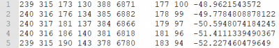
This number may be slightly less or more depending on the OrbiCraft's rotation speed. Since a circle is usually divided into 360 degrees, the angle value on each row of our table should differ from the previous value by 360/441 = 0.816327 degrees. Copy the angle value from cell J1 to the top cell of column K (cell K1). In cell K2, enter this formula:

Double-click in the lower right corner of cell K2, the formula will be copied to all cells in column K.

Now all the angle values should be normalized in the range from -180 to 180 degrees. Find the line where the angle value exceeds 180 degrees, change the formula in this line.
![]()
Formulas in other cells should not be changed. Now all the angle values in the table are in the range from -180 to 180.
To visually assess the error of the magnetometer, plot a diagram using the outer right columns with angle values.
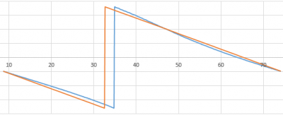
The diagram clearly shows that even a calibrated magnetometer is wrong in measuring angles. Now we need to remove all redundant data from the table. Copy column K and paste the data into column L as values. Now delete columns J and K, as well as the first column A with the measurement time. Although Excel separates the whole part from the decimal point, Python uses a dot for this. Using the replace function (Ctrl-H), replace all commas with dots in the file.
Now transfer all the processed data back to Notepad++. Select all the data in Excel and press Ctrl-C. Open Notepad++, create a new project and paste the data using Ctrl-V.
The inserted data is separated by tabs and newline characters, but we need separation according to the rules of the Python language - separation by comma and space. Press Ctrl-H, type \t in the upper window, enter a comma with a space in the lower window. Click "Replace All" or "Replace in all open documents".
Now we will replace the newline characters in the same way. Press Ctrl-H, type \r\n in the upper window, enter a comma with a space in the lower window. Click "Replace All" or "Replace in all open documents".
Now all the data is listed in one line. We will create an array based on this string. Save the data file in .txt format.